
[Android] Compose CollapsingAppBar 만들기
Compose에는 CollapsingToolbarLayout이 없습니다. 이런 UI를 개발하려면 Custom Composable을 만들어 주어야 합니다.
M3 TopAppBar
비슷한 동작을 하는 Composable로 Material3의 TopAppBar를 사용할 수도 있습니다.
문서상으로 TopAppBar 종류는 4가지가 있고
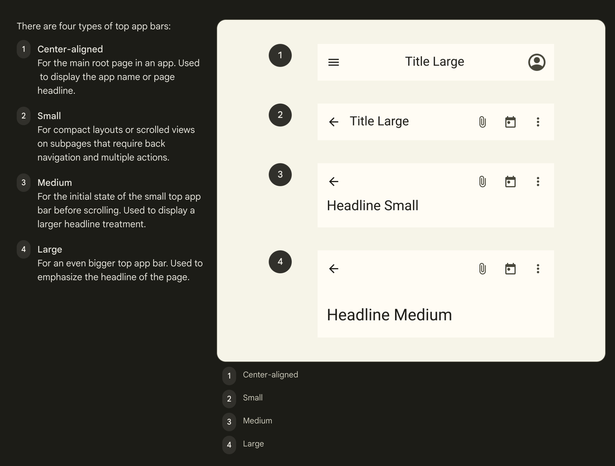
4가지 모두 구현에 scrollBehavior를 추가할 수 있습니다.
CollapsingToolbarLayout에서 사용하던 scrollBehavior와 거의 동일합니다.
@ExperimentalMaterial3Api
@Composable
fun TopAppBar(
    title: @Composable () -> Unit,
    modifier: Modifier = Modifier,
    navigationIcon: @Composable () -> Unit = {},
    actions: @Composable RowScope.() -> Unit = {},
    windowInsets: WindowInsets = TopAppBarDefaults.windowInsets,
    colors: TopAppBarColors = TopAppBarDefaults.topAppBarColors(),
    scrollBehavior: TopAppBarScrollBehavior? = null
)
ScrollBehavior의 동작은 3가지
 |
 |
 |
|---|---|---|
exitUntilCollapsedScroll |
____enterAlwaysScroll____ |
_______pinnedScroll_______ |
| 스크롤이 최상단에 있을 때만 앱바가 열리고 닫힘 | 스크롤을 아래로 내리면 스크롤 위치 상관없이 앱바가 열림 | 앱바 안열림 |
Compose 로는 아래처럼 작성하여 사용할 수 있습니다.
val scrollBehavior = TopAppBarDefaults.exitUntilCollapsedScrollBehavior()

Scaffold(
	topBar = { TopAppBar(scrollBehavior = scrollBehavior, ..) } //CollapsingToolbarLayout
) {
	// 원하는 Composables
}
View에서 CollapsingToolbarLayout은 보통 아래와 같은 형태로 사용했습니다.
TopAppBar와의 차이는 AppBarLayout의 유무입니다. View에서 위와 같은 UI를 구현하려면 아래와 같이 여러 계층구조가 필수였으나, Compose는 훨씬 간단하게 사용할 수 있습니다.
<CoordinatorLayout>
	<AppBarLayout>
		<CollapsingToolbarLayout>
		</CollapsingToolbarLayout>
	</AppBarLayout>
  <!-- 원하는 레이아웃 -->
</CoordinatorLayout>
Custom CollapsingAppBar
UI의 요구사항이 TopAppBar 를 사용하는 것으로 충족된다면 상관없지만,
Compose의 TopAppBar는 사이즈와 같은 스펙이 지정되어 있어서, 요구사항을 맞추지 못할 수 있습니다.
진행중인 프로젝트에서도 마찬가지인데요… 😇
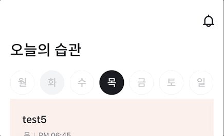
TopAppBar를 사용하면 타이틀 동작은 가능하지만, 월~일 버튼은 접히지 않고 남아있게 됩니다.

M3 TopAppBar 의 코드를 이용하여 CollapsingAppBar를 만들어봅시다!!
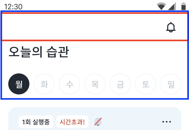
위 이미지에서 빨간 박스가 접히지 않는 영역, 파란 박스가 접히는 영역입니다.
필요한 컴포저블은 총 4가지인데,
- TopBar - 빨간 박스 영역
- CollapsingContent - 파란 박스 영역
- ExpandedTitle
- CollapsedTitle
이들을 원하는대로 배치하기 위해 커스텀 레이아웃을 만듭니다.
우선 필요한 값들을 받는 CollapsingAppBar를 선언합니다. (xml CollapsingToolbarLayout과 비슷한 속성들을 가지도록 했어요.)
title만 필요한 상황이기 때문에 ExpandedTitle, CollapsedTitle을 별도로 받지 않고 title: string만 받습니다. 또한, 파란 영역은 배경이 바뀔 수 있는 요구사항이 있어, collapsingContent는 @Composable () -> Unit으로 받아줍니다.
@OptIn(ExperimentalMaterial3Api::class)
@Composable
fun CollapsingAppBar(
    modifier: Modifier = Modifier,
    backgroundColor: Color = White,
    title: String = "",
    collapsedTitleStyle: TextStyle = Heading16B,
    expandedTitleStyle: TextStyle = Heading24M,
    expandedTitleStartPadding: Dp = 16.dp,
    minHeight: Dp = 56.dp,
    scrollBehavior: TopAppBarScrollBehavior,
    collapsingContent: @Composable () -> Unit = {}
) {
   ..
}
아래처럼 더 자유롭게 커스텀할 수 있으나, 그렇게까지는 필요없어서 생략..
collapsedTitle: @Composable () → Unit,
expandedTitle: @Composable () → Unit
Collasping 동작이 가능한 AppBar를 만드는 방법은 여러가지가 있겠지만, 스크롤 처리를 위해서 M3의 TopAppBarScrollBehavior를 사용합니다.
보통은 AppBar 아래쪽 컨텐츠에 scroll 가능한 UI(LazyList)가 오고, 이 UI의 스크롤을 시작하기 전에 AppBar를 먼저 접어주어야 하기 때문이에요.
TopAppBarScrollBehavior는 아래와 같은 interface 이며, 여기에서 state와 nestedScrollConnection을 사용할 예정입니다.
@ExperimentalMaterial3Api
@Stable
interface TopAppBarScrollBehavior {
    val state: TopAppBarState
    val isPinned: Boolean
    val snapAnimationSpec: AnimationSpec<Float>?
    val flingAnimationSpec: DecayAnimationSpec<Float>?
    val nestedScrollConnection: NestedScrollConnection
}
TopAppBarState도 아래처럼 생겼는데, heightOffsetLimit와 heightOffset을 눈여겨 봐주세요.
@ExperimentalMaterial3Api
@Stable
class TopAppBarState(
    initialHeightOffsetLimit: Float,
    initialHeightOffset: Float,
    initialContentOffset: Float
) {

    var heightOffsetLimit by mutableStateOf(initialHeightOffsetLimit)

    var heightOffset: Float
        get() = _heightOffset.value
        set(newOffset) {
            _heightOffset.value = newOffset.coerceIn(
                minimumValue = heightOffsetLimit,
                maximumValue = 0f
            )
        }

    var contentOffset by mutableStateOf(initialContentOffset)

    val collapsedFraction: Float
        get() = if (heightOffsetLimit != 0f) {
            heightOffset / heightOffsetLimit
        } else {
            0f
        }

    val overlappedFraction: Float
        get() = if (heightOffsetLimit != 0f) {
            1 - ((heightOffsetLimit - contentOffset).coerceIn(
                minimumValue = heightOffsetLimit,
                maximumValue = 0f
            ) / heightOffsetLimit)
        } else {
            0f
        }

    companion object {
        val Saver: Saver<TopAppBarState, *> = listSaver(
            save = { listOf(it.heightOffsetLimit, it.heightOffset, it.contentOffset) },
            restore = {
                TopAppBarState(
                    initialHeightOffsetLimit = it[0],
                    initialHeightOffset = it[1],
                    initialContentOffset = it[2]
                )
            }
        )
    }

    private var _heightOffset = mutableStateOf(initialHeightOffset)
}
우선 scrollBehavior.state.heightOffsetLimit 값을 지정해줍니다. 이 코드는 TopAppBar의 내부 구현을 따라가다보면 만날 수 있는 코드에요.
collapsingContentHeight는 파란 영역의 높이값을 저장한 변수입니다.
Composable 구성이 끝났을 때 collapsingContentHeight의 값을 알 수 있고, 이를 이용하여 offsetLimit의 값을 지정해줍니다.
툴바 아래 접히는 영역의 사이즈입니다. (파란 영역 사이즈 - 빨간 영역 사이즈)
@OptIn(ExperimentalMaterial3Api::class)
@Composable
fun CollapsingAppBar(
    modifier: Modifier = Modifier,
    backgroundColor: Color = White,
    title: String = "",
    collapsedTitleStyle: TextStyle = Heading16B,
    expandedTitleStyle: TextStyle = Heading24M,
    expandedTitleStartPadding: Dp = 16.dp,
    minHeight: Dp = 56.dp,
    scrollBehavior: TopAppBarScrollBehavior,
    collapsingContent: @Composable () -> Unit = {}
) {
    ..
	  var collapsingContentHeight by remember { mutableStateOf(0) }
    val minHeightPx = LocalDensity.current.run { minHeight.toPx() }

    SideEffect {
        val limit = minHeightPx - collapsingContentHeight.toFloat()
        if (scrollBehavior.state.heightOffsetLimit != limit) {
            scrollBehavior.state.heightOffsetLimit = limit
        }
    }
}
그 아래에 AppBar 영역을 드래그했을 때 AppBar가 접힐 수 있도록 도와주는 Modifier를 작성합니다. (이 코드도 TopAppBar의 내부 구현을 살펴보세요.)
이 중 settleAppBar도 TopAppBar 내부 구현에서 가져왔습니다. 드래그 velocity에 따라 AppBar fling 동작을 수행합니다.
@OptIn(ExperimentalMaterial3Api::class)
@Composable
fun CollapsingAppBar(
    modifier: Modifier = Modifier,
    backgroundColor: Color = White,
    title: String = "",
    collapsedTitleStyle: TextStyle = Heading16B,
    expandedTitleStyle: TextStyle = Heading24M,
    expandedTitleStartPadding: Dp = 16.dp,
    minHeight: Dp = 56.dp,
    scrollBehavior: TopAppBarScrollBehavior,
    collapsingContent: @Composable () -> Unit = {}
) {
    ...

    val appBarDragModifier = if (!scrollBehavior.isPinned) {
        Modifier.draggable(
            orientation = Orientation.Vertical,
            state = rememberDraggableState { delta ->
                scrollBehavior.state.heightOffset = offset + delta
            },
            onDragStopped = { velocity ->
                settleAppBar(
                    scrollBehavior.state,
                    velocity,
                    scrollBehavior.flingAnimationSpec,
                    scrollBehavior.snapAnimationSpec
                )
            }
        )
    } else {
        Modifier
    }
}

@OptIn(ExperimentalMaterial3Api::class)
private suspend fun settleAppBar(
    state: TopAppBarState,
    velocity: Float,
    flingAnimationSpec: DecayAnimationSpec<Float>?,
    snapAnimationSpec: AnimationSpec<Float>?
): Velocity {
    if (state.collapsedFraction < 0.01f || state.collapsedFraction == 1f) {
        return Velocity.Zero
    }
    var remainingVelocity = velocity
    if (flingAnimationSpec != null && abs(velocity) > 1f) {
        var lastValue = 0f
        AnimationState(
            initialValue = 0f,
            initialVelocity = velocity,
        )
            .animateDecay(flingAnimationSpec) {
                val delta = value - lastValue
                val initialHeightOffset = state.heightOffset
                state.heightOffset = initialHeightOffset + delta
                val consumed = abs(initialHeightOffset - state.heightOffset)
                lastValue = value
                remainingVelocity = this.velocity
                if (abs(delta - consumed) > 0.5f) this.cancelAnimation()
            }
    }
    if (snapAnimationSpec != null) {
        if (state.heightOffset < 0 &&
            state.heightOffset > state.heightOffsetLimit
        ) {
            AnimationState(initialValue = state.heightOffset).animateTo(
                if (state.collapsedFraction < 0.5f) {
                    0f
                } else {
                    state.heightOffsetLimit
                },
                animationSpec = snapAnimationSpec
            ) { state.heightOffset = value }
        }
    }

    return Velocity(0f, remainingVelocity)
}
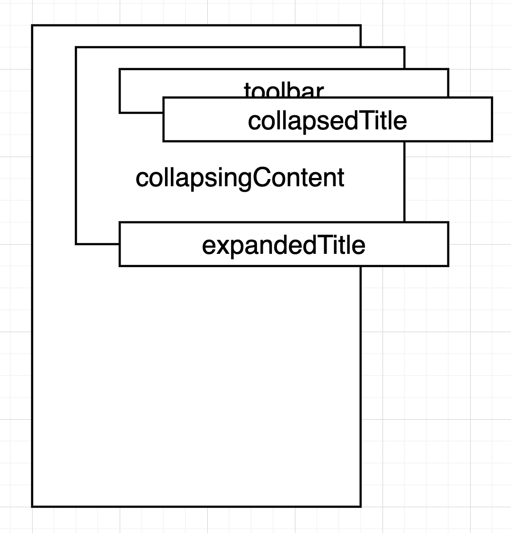
이제 위에서 언급했던 4가지 Composable로 Custom composable을 만들어줍니다.
- TopBar - 빨간 박스 영역
- CollapsingContent - 파란 박스 영역
- ExpandedTitle
- CollapsedTitle
Composable에서 Custome composable을 만들기 위해서는 Layout() Composable을 이용합니다.
- Layout() Composable의 content 에 배치하기를 원하는 자식 Composable들을 넣어줍니다.
- 자식 Composable의 크기를 측정고,
- 원하는 위치에 배치합니다.
측정 시 각 measurable 구분의 편의를 위해 자식 Composable에 각각의 id를 담아 layoutId Modifer를 붙여줍니다.
Surface(
        modifier = modifier
            .background(backgroundColor)
            .systemBarsPadding()
            .statusBarsPadding()
            .then(appBarDragModifier)
    ) {
        Layout(
            content = {
                Box(modifier = Modifier.layoutId("collapsingContent")) { collapsingContent() }
                Box(
                    Modifier
                        .layoutId("toolbar")
                        .fillMaxWidth()
                        .height(minHeight)
                        .background(White)
                ) {
					...
                }
                Text(
                    modifier = Modifier
                        .layoutId("expandedTitle")
                        .alpha(expandedTitleAlpha)
                        .padding(
                            top = 3.dp,
                            start = expandedTitleStartPadding
                        ),
                    text = title, color = Primary, style = expandedTitleStyle
                )
                Text(
                    modifier = Modifier
                        .layoutId("collapsedTitle")
                        .alpha(collapsedTitleAlpha),
                    text = title, color = Primary, style = collapsedTitleStyle
                )
            },
            modifier = Modifier
                .statusBarsPadding()
                .systemBarsPadding(),
        ) { measurables, constraints ->
            ...
        }
    }
expandedTitle과 collapsedTitle에는 alpha가 적용되어있는데, AppBar 상태에 알맞은 title만을 보여주기 위해 사용합니다.
    val baseOffset =  if (scrollBehavior.state.heightOffsetLimit > minHeightPx) -minHeightPx else (minHeightPx - collapsingContentHeight)
    val titleCollapsedFraction = offset / baseOffset
    val collapsedTitleAlpha =
        CubicBezierEasing(.8f, 0f, .8f, .15f).transform(titleCollapsedFraction)
    val expandedTitleAlpha = 1f - titleCollapsedFraction
이제 자식 Composable들을 측정합니다. Layout() Composable에 전달되는 MeasurePolicy.measure 함수는 measurables와 constraints를 받는데, 4개 자식 Composable에 대한 measurable을 찾아서 측정하면 각각의 크기를 알 수 있습니다.
여기서 알게된 collapsingContentHeight 값이 CollapsingAppBarLayout의 최대 높이가 됩니다.
Surface(
       ..
    ) {
        Layout(
            ..
        ) { measurables, constraints ->
            val ccPlaceable =
                measurables.find { it.layoutId == "collapsingContent" }.measure(constraints)
            val tbPlaceable =
                measurables.find { it.layoutId == "toolbar" }.measure(constraints)
            val titlePlaceable =
                measurables.find { it.layoutId == "expandedTitle" }.measure(constraints)
            val collapsedTitlePlaceable =
                measurables.find { it.layoutId == "collapsedTitle" }.measure(constraints)

            collapsingContentHeight = ccPlaceable.height
            ..
        }
    }
CollapsingAppBar는 스크롤 동작 중에 높이가 변경됩니다.
변경된 높이는 collapsingContentHeight(최대 높이) - scrollBehavior.state.scrollOffset 를 이용할 수 있고, 이 값이 currentHeight가 됩니다.
currentHeight는 현재 그려지는 CollapsingAppBarLayout의 높이가 됩니다.
요렇게 배치할거에요.
Surface(
        ..
    ) {
        Layout(
            ..
        ) { measurables, constraints ->
            ..

            val maxWidth =
                listOf(ccPlaceable.width, tbPlaceable.width).max()
            val currentHeight =
                collapsingContentHeight + scrollBehavior.state.heightOffset


		layout(maxWidth, currentHeight.toInt()) {
                ccPlaceable.placeRelative(
                    0, scrollBehavior.state.heightOffset.roundToInt()
                )
                titlePlaceable.placeRelative(
                    0,
                    minHeight.roundToPx() + scrollBehavior.state.heightOffset.roundToInt()
                )
                tbPlaceable.placeRelative(0, 0)
                collapsedTitlePlaceable.placeRelative(
                    (maxWidth - collapsedTitlePlaceable.width) / 2,
                    (pinnedHeightPx - collapsedTitlePlaceable.height).toInt() / 2
                )
            }
        }
    }
layout() 함수를 통해 자식 Composable을 배치합니다. x 값은 중요하지 않고.. y값이 중요합니다.
- collapsingContent는 y는 0부터 현재 스크롤 offset
- toolbar는 최상단
- expandedTitle 은 toolbar 바로 아래 + 현재 스크롤 offset
- collapsedTitle 은 toolbar 중앙에
완성
CollapsingAppBar가 완성되었고, TopAppBarScrollBehavior를 적용하면 아래처럼 동작합니다.
 |
 |
|---|---|
exitUntilCollapsedScroll |
enterAlwaysScroll |
pinned 는 생략…
완성 코드는 여기!
Comments